VizExplorer Bolsters Website To Reflect Their Vibrant New Brand
A few months ago a colleague introduced me to the VizExplorer (formerly Bis2) team - a leader in gaming analytics. Their team is made up of vibrant, intelligent and wildly talented individuals. Best of all, their customers are raving fans. As a result the company is poised for tremendous growth. But you wouldn't know it from their website.The old site was functional and had a lot of great content. The only problem was it didn't reflect the true nature of the team or the VizExplorer business - data visualization. The site was not responsive for mobile devices, the home page didn't quickly spotlight what the company did, and much of the inside content was visually unattractive and very text heavy. If you knew the company well you'd find a wealth of value from the site. But...if you were new to their products it wasn't enticing.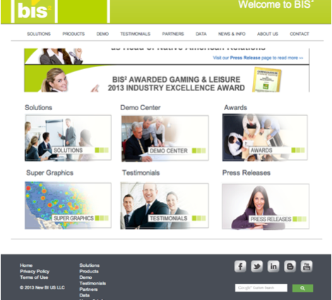
 Recognizing the opportunity to enhance the business, VizExplorer engaged the Marketing Advisory Network to create a brand that more accurately reflected the business. While it might have been easier to start with the look & feel of the website, the team took a step back and started the right way - with persona research, internal workshops and message testing interviews. In less than 5 months the company had a new company name, logo, brand guidelines, tested message platform, rebranded collateral, new overview presentation (and the associated sales training) two new case studies and an exciting new website.It was a whirlwind ride and one that wouldn't have been possible without tremendous partnership between myself, the VizExplorer team and our design partner Bob Olson of Olson Design.The new website that launched just a few days ago illustrates the new brand nicely.
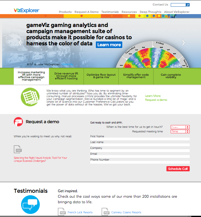
- The home page now has three banners which accurately reflect the company's value proposition in case you visit without much prior knowledge.
- The five core value propositions aligned to buyer personas are now prominent tabs directly under the home page banner. Within each is a core value proposition and links to additional, relevant content.
- The site is now seen as an introduction. Once made we want to get to know our visitors so they are invited to request a demo. We even ask for the specific day and time that works for their schedule.
- Case studies are easy to find even from the home page
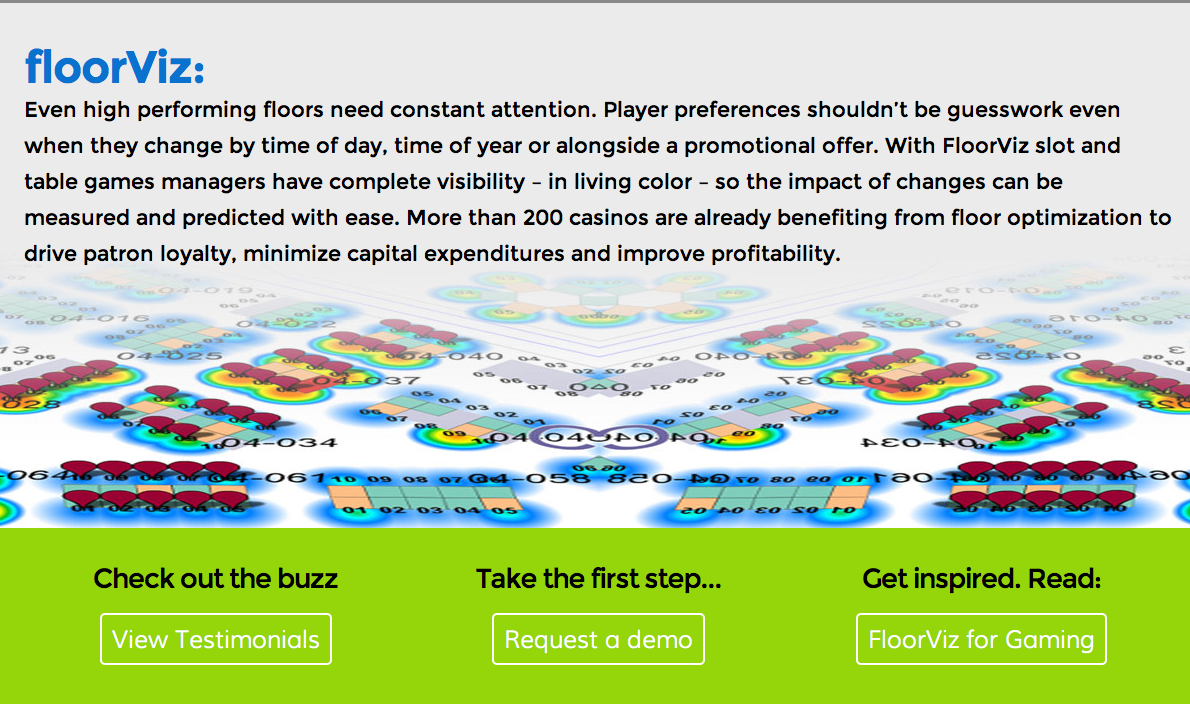 The website is now designed to accommodate mobile viewing. Each product has a short description designed to tease the visitor into wanting more information. After which follow-up action steps where in-depth content is available can easily be found.
 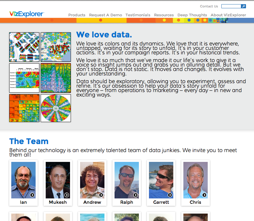 The website is the beginning of a dialog and as such the About VizExplorer page now reflects the company's vision and even introduces the entire team to visitors.
 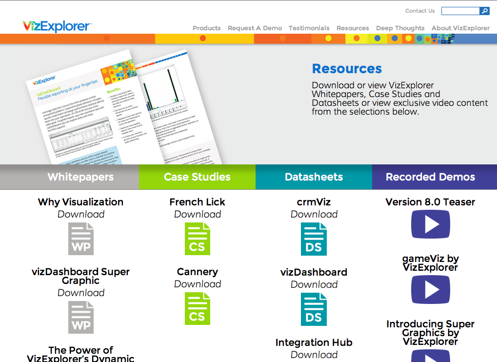 Best of all those great resources are easy to find in the Resources section. The site is V1 and has been designed with this in mind. The infrastructure has been built to support a blog and industry content which will be added in the future to assist with SEO goals.Congratulations to VizExplorer on the beginning of an exciting new journey!I hope it has inspired you to look at your website in new ways.